All Categories
- Aesthetic Presets
- Cinematic Presets
- Portraits Presets
- Bright & Airy Presets
- Wedding Presets
- Travel Presets
- Film Presets
- Vintage Presets
- Beginners Presets
- Black & White Presets
- Food Presets
- Instagram Presets
- Mobile Presets
- Moody Presets
- Nature Presets
- Product Presets
- Professional Presets
- Real Estate Presets
- Sport Presets
- Summer Presets
- Wildlife Presets
- Winter Presets


portrait presets lightroom
Family Portrait Presets
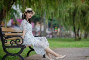
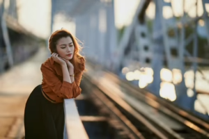
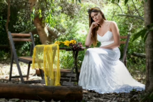
The Black and Family Portrait Presets are portrait presets lightroom that give Lightroom users amazing skin tones, depth to the images and balanced shadowing throughout their photos making for timeless photography. These presets are perfect for beautiful black inspiried portraits and warm, natural photographs of your family. Ideal for professional looks, they will turn regular into pro and make every portrait session unique and up to date.
Post Title :
portrait presets lightroom
Presets Name :
Family Portrait Presets
Brand :
File Type :
DNG , .XMP
Compatibility :
Mobile, Windows, Mac
Price :
Free To Download
How to Use
Family Portrait Presets
on Mobile ( iOS & Android ):
- Adobe Lightroom Mobile is downloadable from the App Store or Google Play.
- Download and unzip the preset files and you will get DNG on your iOS & Android.
- Open up Lightroom Mobile and either create/sign on an Adobe account.
- Import the DNG preset file: Launch Lightroom > tap three-dot menu > Import Presets > select the preset files on your device.
- Open a photo in Lightroom mobile, then swipe up on the checklist of presets at the bottom to view all associated with your account.
- You can now tap on the imported preset and a TOOLS-based organizer will pop up where you need to paste (“APPLY”) this specific preset on your photo.
- Make any adjustments if necessary and save/export your edited photo.
- How to Use Presets on Windows
- Unzip the downloaded files that will be in XMP format.
- Open the Lightroom desktop application.
- There, click on File > Import Profiles and Presets.
- Choose the folder containing your unzipped preset files.
- Tap Import to import the presets into Lightroom.
- 3> Open a photo, go into the Develop module, you wil see the Presets panel on left side and Look for the preset.
- Swipe the sliders to adjust pieces of the photo, then save off a copy of what you changed.
- How to use Presets on macOS:
- Download and unzip the preset files on your Mac.
- Open and select Lightroom desktop on your Mac.
- File — Import Profiles and Presets…from the top menu.
- Find the preset files on your Mac and open them.
- Press on Import to use presets in Lightroom.
- Open a photo in the Develop module and navigate to the Presets panel, choose a preset.
- Edit the photo to your liking when finished save it or export the edited version.
- Additional tips:
- If you sync your presets with Lightroom CC desktop, they will automatically appear on lightroom mobile when you’re logged in with the same Adobe account.
- This is a workflow option for consistent editing using Lightroom presets, no matter the device. The import differs slightly by platform but the process is simple on all devices. After you have the presets set, the rest is as simple as a click or tap for some big time savings when you’re editing.
portrait presets lightroom
Setting | Value | Descriptions
Basic Panel (Tone & Presence)
| Basic | Value | Description |
| Temp | 0 | Keeps the temperature of the image as it was shot. |
| Tint | 0 | Keeps the balance between magenta and green neutral. |
| Exposure | 0.79 | Brightens the picture to let in more light overall. |
| Contrast | -11 | Makes the tones softer by lowering the contrast. |
| Highlights | -2 | Recovers some bright detail. |
| Shadows | 72 | Makes dark areas brighter so that details are easier to see. |
| Whites | -76 | To control brightness, it lowers the intensity of white. |
| Blacks | 32 | Raises the black levels for a matte finish that looks faded. |
| Texture | 24 | Improves the clarity and detail of fine surfaces. |
| Clarity | 8 | Adds a little bit of contrast to the midtones to make things look sharper. |
| Dehaze | 16 | Lessens haze and makes everything look deeper. |
| Vibrance | 11 | Increases muted colors naturally without making them too bright. |
| Saturation | -13 | For balance, it slightly lowers the intensity of all colors. |
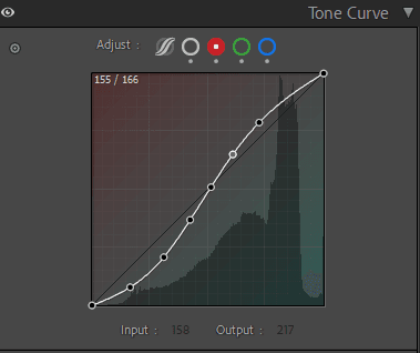
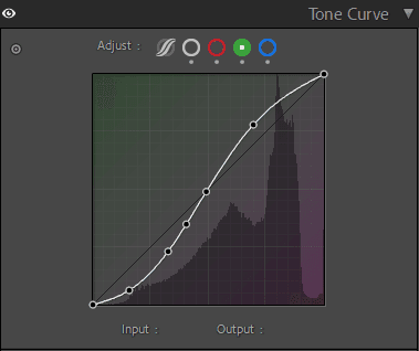
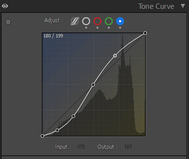
Tone Curve Panel
HSL / Color Mixer Panel
| Color Mixer (HSL) | Setting | Value | Description |
| Hue | Red | 46 | Pushes reds toward pink. |
| Orange | -5 | Makes oranges a little warmer. | |
| Yellow | -30 | For warmth, it moves yellows closer to orange. | |
| Green | 26 | Changes greens a little bit to lime tones. | |
| Aqua | -48 | Pushes aqua tones toward teal. | |
| Blue | 14 | Changes the color of blues to a slightly purple shade. | |
| Purple | 0 | Leaves purples alone. | |
| Magenta | 28 | Gives magenta colors a red tint. | |
| Saturation | Red | -14 | Decreases the saturation of red to make it softer. |
| Orange | -27 | Mutes orange tones to make skin tones look more even. | |
| Yellow | -30 | For a clean, warm look, it takes the yellow out of the picture. | |
| Green | -70 | For a cinematic tone, it greatly lowers the saturation of green. | |
| Aqua | -21 | Makes aqua tones less harsh. | |
| Blue | -48 | Turns down blue tones for a calm, muted look. | |
| Purple | -48 | Makes purple less bright to make it more neutral. | |
| Magenta | -11 | Makes magenta colors a little less bright. | |
| Luminance | Red | -4 | Makes reds a little darker for deeper tones. |
| Orange | 21 | Makes orange brighter (makes skin tone glow more). | |
| Yellow | 6 | Makes yellows a little lighter. | |
| Green | 6 | Makes greens a little brighter. | |
| Aqua | 6 | Makes aqua tones lighter. | |
| Blue | 4 | Makes blues brighter to make things clearer. | |
| Purple | 67 | Makes purple tones much lighter. | |
| Magenta | 23 | Makes magenta tones lighter to balance things out. |
Colour Grading Panel
| Color Grading | Tone Area | Hue | Description |
| Shadows | 34 | 11 | Gives shadows a warm amber color. |
| Highlights | 14 | 13 | Adds a soft, warm glow to the bright spots. |
| Luminance | 0 | — | Keeps the brightness the same. |
| Blending | 100 | — | The tones of the highlight and shadow blend smoothly. |
| Balance | -60 | — | More focus on the warmth of the shadow. |
Detail Panel
| Noise Reduction (Detail Panel) | Setting | Value | Description |
| Luminance | 27 | Makes the picture look smoother by reducing grain. | |
| Detail | 74 | Keeps more small details while cutting down on noise. | |
| Contrast | 20 | Adds a little definition back to areas that have been smoothed. | |
| Color | 17 | Gets rid of noise and color speckles. | |
| Detail | 50 | Keeps color details in balance. | |
| Smoothness | 50 | Keeps tones from blending too much. |