All Categories
- Aesthetic Presets
- Cinematic Presets
- Portraits Presets
- Bright & Airy Presets
- Wedding Presets
- Travel Presets
- Film Presets
- Vintage Presets
- Beginners Presets
- Black & White Presets
- Food Presets
- Instagram Presets
- Mobile Presets
- Moody Presets
- Nature Presets
- Product Presets
- Professional Presets
- Real Estate Presets
- Sport Presets
- Summer Presets
- Wildlife Presets
- Winter Presets


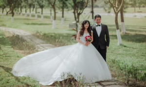
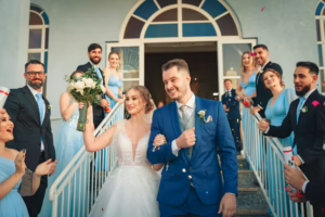
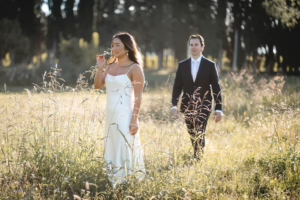
lightroom presets wedding
Light and Airy Wedding Presets
Lightroom presets wedding collections inject class and romance into your big day, and our Light Airy Wedding Presets were born to make timelessly magical memories. Whit soft colors, subtle highlights and dreamy light, these presets brighten skin tones & natural light creating a romantic fresh ethereal look to your wedding photos for the modern yet not set in time couple!
Post Title :
lightroom presets wedding
Presets Name :
Light and Airy Wedding Presets
Brand :
File Type :
DNG , .XMP
Compatibility :
Mobile, Windows, Mac
Price :
Free To Download
How to Use
Light and Airy Wedding Presets
on Mobile ( iOS & Android ):
- Adobe Lightroom Mobile is downloadable from the App Store or Google Play.
- Download and unzip the preset files and you will get DNG on your iOS & Android.
- Open up Lightroom Mobile and either create/sign on an Adobe account.
- Import the DNG preset file: Launch Lightroom > tap three-dot menu > Import Presets > select the preset files on your device.
- Open a photo in Lightroom mobile, then swipe up on the checklist of presets at the bottom to view all associated with your account.
- You can now tap on the imported preset and a TOOLS-based organizer will pop up where you need to paste (“APPLY”) this specific preset on your photo.
- Make any adjustments if necessary and save/export your edited photo.
- How to Use Presets on Windows
- Unzip the downloaded files that will be in XMP format.
- Open the Lightroom desktop application.
- There, click on File > Import Profiles and Presets.
- Choose the folder containing your unzipped preset files.
- Tap Import to import the presets into Lightroom.
- 3> Open a photo, go into the Develop module, you wil see the Presets panel on left side and Look for the preset.
- Swipe the sliders to adjust pieces of the photo, then save off a copy of what you changed.
- How to use Presets on macOS:
- Download and unzip the preset files on your Mac.
- Open and select Lightroom desktop on your Mac.
- File — Import Profiles and Presets…from the top menu.
- Find the preset files on your Mac and open them.
- Press on Import to use presets in Lightroom.
- Open a photo in the Develop module and navigate to the Presets panel, choose a preset.
- Edit the photo to your liking when finished save it or export the edited version.
- Additional tips:
- If you sync your presets with Lightroom CC desktop, they will automatically appear on lightroom mobile when you’re logged in with the same Adobe account.
- This is a workflow option for consistent editing using Lightroom presets, no matter the device. The import differs slightly by platform but the process is simple on all devices. After you have the presets set, the rest is as simple as a click or tap for some big time savings when you’re editing.
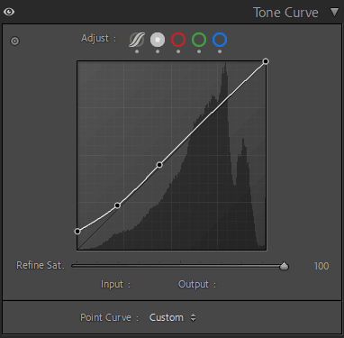
lightroom presets wedding
Setting | Value | Descriptions
Basic Panel (Tone & Presence)
| Basic | Value | Description |
| Temp | 0 | Keeps the original temperature of the white balance. |
| Tint | 0 | There is no change in the magenta or green tint. |
| Exposure | 0.5 | Makes the whole picture brighter. |
| Contrast | -19 | Reduces contrast for a softer, more matte look. |
| Highlights | -25 | Brings down bright spots to keep details in the highlights. |
| Shadows | 35 | Brings out shadow details so you can see better in the dark. |
| Whites | 0 | Keeps the white levels even. |
| Blacks | 25 | Brings up the black point to make a faded, film-like tone. |
| Texture | 0 | Keeps the little things the same. |
| Clarity | 0 | No change to the midtone contrast. |
| Dehaze | 0 | Doesn’t touch the haze on the leaves. |
| Vibrance | 0 | Keeps the color intensity low. |
| Saturation | 5 | Gives the overall color a slight boost. |
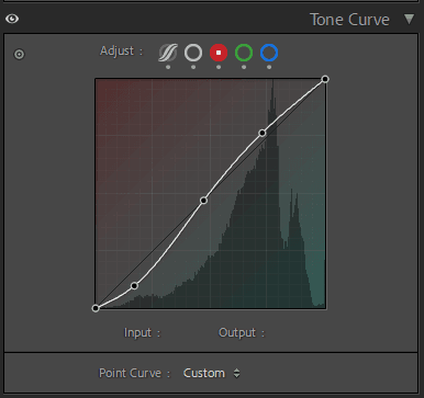
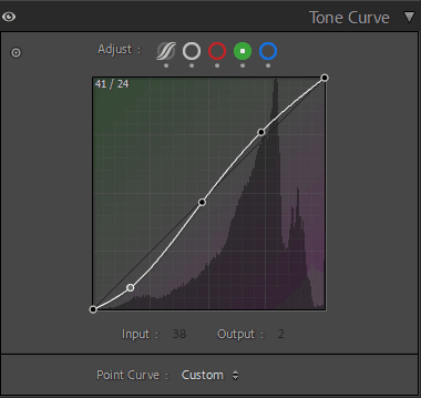
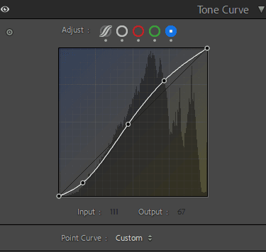
Tone Curve Panel
HSL / Color Mixer Panel
| (HSL / Color Mixer ) | Value | Description |
| Red Hue | 8 | Changes reds a little bit to orange. |
| Orange Hue | 2 | Gently warms orange tones. |
| Yellow Hue | 0 | Keeps yellows from being too bright. |
| Green Hue | 18 | Moves greens a little closer to aqua. |
| Aqua Hue | 0 | Keeps aqua the same. |
| Blue Hue | 5 | Pushes blues a little bit toward violet. |
| Purple Hue | 30 | Makes purple tones more magenta. |
| Magenta Hue | 15 | Heats magentas a little bit. |
| Red Saturation | 4 | Makes red a little brighter. |
| Orange Saturation | -5 | Makes oranges less bright for more even skin tones. |
| Yellow Saturation | 0 | Leaves yellow the same. |
| Green Saturation | -30 | Makes greens less bright for a movie-like look. |
| Aqua Saturation | -15 | Makes aqua colors less harsh. |
| Blue Saturation | 0 | Leaves blues alone. |
| Purple Saturation | -10 | Makes purples a little less bright. |
| Magenta Saturation | -20 | Lowers the intensity of magenta for softer tones. |
| Red Luminance | -20 | Adds depth by making reds darker. |
| Orange Luminance | 0 | Keeps the brightness of orange natural. |
| Yellow Luminance | 0 | Keeps yellows in check. |
| Green Luminance | -15 | Makes greens darker to make them stand out. |
| Aqua Luminance | 0 | Keeps the brightness of aqua neutral. |
| Blue Luminance | -10 | Makes blue areas a little darker. |
| Purple Luminance | 0 | Still the same. |
| Magenta Luminance | -25 | Darkens magentas to give them depth. |
Detail Panel
| Detail | Value | Description |
| Sharpening Amount | 80 | Strong sharpening to bring out small details. |
| Radius | 1.2 | A moderate sharpening radius. |
| Detail | 4 | Reduces noise by softening sharpening details. |
| Masking | 15 | Only lightly sharpens the edges. |
Calibration Panel
| Calibration | Value | Description |
| Red Primary Hue | 10 | It pushes reds toward orange. |
| Red Primary Saturation | 0 | Keeps the red saturation level. |
| Green Primary Hue | -10 | Changes greens to cooler colors. |
| Green Primary Saturation | -10 | Makes green a little less bright. |
| Blue Primary Hue | -15 | Makes blues more teal. |
| Blue Primary Saturation | 25 | Makes blue pop more. |