All Categories
- Aesthetic Presets
- Cinematic Presets
- Portraits Presets
- Bright & Airy Presets
- Wedding Presets
- Travel Presets
- Film Presets
- Vintage Presets
- Beginners Presets
- Black & White Presets
- Food Presets
- Instagram Presets
- Mobile Presets
- Moody Presets
- Nature Presets
- Product Presets
- Professional Presets
- Real Estate Presets
- Sport Presets
- Summer Presets
- Wildlife Presets
- Winter Presets


lightroom nature presets
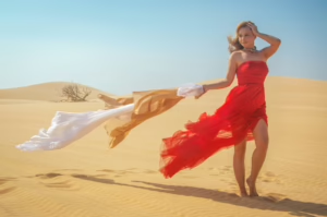
Desert Presets
These free lightroom nature presets get a warm, earthy feel to your springs photos and our desert are especially great if you want to emphasize sunny landscapes with sandy tones and golden colors. Great for travel, portrait and adventure photos these presets make vivid cinematic edits that show off the real depth of feeling you have while shooting in our all time favourite environments- desert.
Post Title :
lightroom nature presets
Presets Name :
Desert Presets
Brand :
File Type :
DNG , .XMP
Compatibility :
Mobile, Windows, Mac
Price :
Free To download
How to Use
Desert Presets
on Mobile ( iOS & Android ):
- Adobe Lightroom Mobile is downloadable from the App Store or Google Play.
- Download and unzip the preset files and you will get DNG on your iOS & Android.
- Open up Lightroom Mobile and either create/sign on an Adobe account.
- Import the DNG preset file: Launch Lightroom > tap three-dot menu > Import Presets > select the preset files on your device.
- Open a photo in Lightroom mobile, then swipe up on the checklist of presets at the bottom to view all associated with your account.
- You can now tap on the imported preset and a TOOLS-based organizer will pop up where you need to paste (“APPLY”) this specific preset on your photo.
- Make any adjustments if necessary and save/export your edited photo.
- How to Use Presets on Windows
- Unzip the downloaded files that will be in XMP format.
- Open the Lightroom desktop application.
- There, click on File > Import Profiles and Presets.
- Choose the folder containing your unzipped preset files.
- Tap Import to import the presets into Lightroom.
- 3> Open a photo, go into the Develop module, you wil see the Presets panel on left side and Look for the preset.
- Swipe the sliders to adjust pieces of the photo, then save off a copy of what you changed.
- How to use Presets on macOS:
- Download and unzip the preset files on your Mac.
- Open and select Lightroom desktop on your Mac.
- File — Import Profiles and Presets…from the top menu.
- Find the preset files on your Mac and open them.
- Press on Import to use presets in Lightroom.
- Open a photo in the Develop module and navigate to the Presets panel, choose a preset.
- Edit the photo to your liking when finished save it or export the edited version.
- Additional tips:
- If you sync your presets with Lightroom CC desktop, they will automatically appear on lightroom mobile when you’re logged in with the same Adobe account.
- This is a workflow option for consistent editing using Lightroom presets, no matter the device. The import differs slightly by platform but the process is simple on all devices. After you have the presets set, the rest is as simple as a click or tap for some big time savings when you’re editing.
lightroom nature presets
Setting | Value | Descriptions
Basic Panel (Tone & Presence)
| Section | Setting | Value | Description |
| Basic | Temp | -2 | Adjust the color temperature to make it a little cooler. |
| Tint | +6 | Adjust the green/magenta tint (a little magenta). | |
| Exposure | +0.00 | The brightness of the whole image (no change). | |
| Contrast | +19 | Makes the difference between the brightest and darkest areas bigger. | |
| Highlights | -42 | Makes the brightest tones darker. | |
| Shadows | +57 | Makes the darkest tones lighter. | |
| Whites | -19 | Makes the pure white clipping point darker. | |
| Blacks | +20 | Lifts blacks and makes the pure black clipping point lighter. | |
| Texture | +14 | Adds more detail to textures (micro-contrast). | |
| Clarity | +4 | Makes the contrast in the middle tones a little stronger. | |
| Dehaze | +5 | It makes the haze a little less or the contrast and saturation a little more. | |
| Vibrance | +14 | Makes colors that aren’t as saturated more saturated. | |
| Saturation | +19 | Increases the saturation of all colors evenly. |
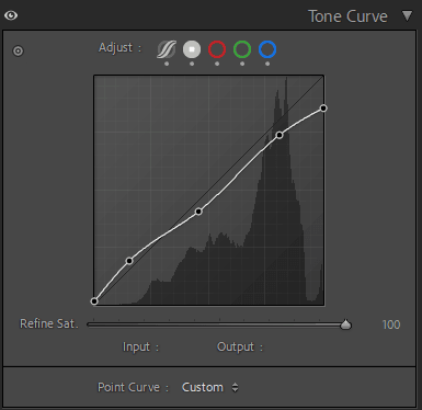
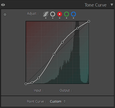
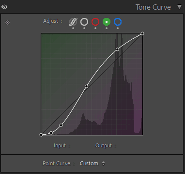
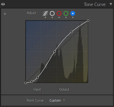
Tone Curve Panel
HSL / Color Mixer Panel
| Section | Setting | Value | Description |
| Color Mixer (HSL – Hue) | Red | +12 | Changes the red color to orange. |
| Orange | +5 | Changes the orange color to yellow. | |
| Yellow | -5 | Changes the yellow color to green. | |
| Green | +5 | Changes the green color to aqua. | |
| Aqua | 0 | Aqua hue stays the same. | |
| Blue | -45 | Changes the blue color to aqua or cyan. | |
| Purple | 0 | The Purple hue stays the same. | |
| Magenta | 0 | The color of Magenta stays the same. | |
| Color Mixer (HSL – Saturation) | Red | -36 | Makes red less bright. |
| Orange | +6 | Slightly makes orange more colorful. | |
| Yellow | +10 | A little bit of yellow. | |
| Green | -48 | Makes green much less saturated. | |
| Aqua | +18 | Saturates Aqua. | |
| Blue | +36 | Saturates Blue a lot. | |
| Purple | -30 | Purple loses color. | |
| Magenta | -30 | Makes Magenta less bright. | |
| Color Mixer (HSL – Luminance) | Red | -8 | Makes red tones darker. |
| Orange | +14 | Makes orange tones brighter. | |
| Yellow | -5 | Makes yellow tones darker. | |
| Green | -10 | Makes green tones darker. | |
| Aqua | 0 | Aqua brightness stays the same. | |
| Blue | -11 | Makes blue tones darker. | |
| Purple | 0 | The brightness of purple stays the same. | |
| Magenta | -15 | Makes magenta tones darker. |
Colour Grading Panel
| Section | Setting | Value | Description |
| Color Grading (Shadows) | Hue | 4 | The tones are a little red/orange. |
| Saturation | 8 | The shadow tone has low saturation. | |
| Luminance | 0 | No way to change the brightness of shadows (other than in the Basic panel). | |
| Color Grading (Midtones) | Hue | 192 | Tones midtones Cyan. |
| Saturation | 5 | Very low saturation for the midtone tone. | |
| Luminance | 0 | No changing the brightness of the midtones. | |
| Color Grading (Global/Combined) | Blending | 50 | Normal change between tones. |
| Balance | 0 | Equal weight for Shadows and Highlights. |
Detail Panel
| Section | Setting | Value | Description |
| Detail (Sharpening) | Amount | 13 | Not very sharp. |
| Radius | 0.7 | Size of fine-grain sharpening. | |
| Detail | 4 | Low detail sharpening (not as harsh on fine textures). | |
| Masking | 19 | A little masking to keep the smoother parts from getting sharper. | |
| Detail (Noise Reduction – Luminance) | Luminance | 19 | Lessens noise in grayscale. |
| Detail | 50 | Standard way to keep details about brightness. | |
| Contrast | 0 | There is no change in contrast during noise reduction for brightness. | |
| Detail (Noise Reduction – Color) | Color | 25 | Lessens color noise (chroma noise). |
| Detail | 50 | Normal keeping of color details. | |
| Smoothness | 50 | Normal smoothing of color noise. |
Effects Panel
| Section | Setting | Value | Description |
| Effects (Grain) | Amount | 0 | There is no film grain. |
| Size | 25 | Not applicable (because the amount is 0). | |
| Roughness | 50 | N/A (because the amount is 0). |
| Section | Setting | Value | Description |
| Effects (Vignetting) | Style | Highlight Priority | Vignette style keeps highlights better. |
| Amount | -14 | Anti-vignette lightens the edges. | |
| Midpoint | 59 | Moves the middle of the effect closer to the edges. | |
| Roundness | -5 | Makes the vignette a little more like a rectangle. | |
| Feather | 70 | The vignette should change slowly and softly. | |
| Highlights | 4 | It protects the brightest parts of the vignette a little bit. |
Calibration Panel
| Section | Setting | Value | Description |
| Calibration | Tint (Shadows) | 0 | No change in the tint of the shadows. |
| Red Primary (Hue) | +10 | Changes red primary to magenta. | |
| Red Primary (Saturation) | -10 | Makes the red primary less bright. | |
| Green Primary (Hue) | +30 | Changes the green primary to yellow. | |
| Green Primary (Saturation) | -20 | Makes the green primary much less saturated. | |
| Blue Primary (Hue) | +5 | Moves the blue primary closer to cyan. | |
| Blue Primary (Saturation) | +20 | Makes the blue primary very full. |