All Categories
- Aesthetic Presets
- Cinematic Presets
- Portraits Presets
- Bright & Airy Presets
- Wedding Presets
- Travel Presets
- Film Presets
- Vintage Presets
- Beginners Presets
- Black & White Presets
- Food Presets
- Instagram Presets
- Mobile Presets
- Moody Presets
- Nature Presets
- Product Presets
- Professional Presets
- Real Estate Presets
- Sport Presets
- Summer Presets
- Wildlife Presets
- Winter Presets


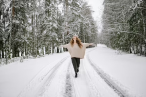
winter lightroom presets
Cool Toned Winter Presets
these Winter Lightroom presets produce a sharp icy feel with cool tone winter Presets for Snowy landscapes, and portrait of seasonal photography. They tone down highlights, eliminate whites, and make shadows even more shadowy; while subtle reflective properties increase the blue tint making them so perfect for a wintery look. Ideal for adding some elegance, clarity, and mood to your winter photographs.

Post Title :
winter lightroom presets
Presets Name :
Cool Toned Winter Presets
Brand :
File Type :
DNG , .XMP
Compatibility :
Mobile, Windows, Mac
Price :
Free To Download
How to Use
Cool Toned Winter Presets
on Mobile ( iOS & Android ):
- Adobe Lightroom Mobile is downloadable from the App Store or Google Play.
- Download and unzip the preset files and you will get DNG on your iOS & Android.
- Open up Lightroom Mobile and either create/sign on an Adobe account.
- Import the DNG preset file: Launch Lightroom > tap three-dot menu > Import Presets > select the preset files on your device.
- Open a photo in Lightroom mobile, then swipe up on the checklist of presets at the bottom to view all associated with your account.
- You can now tap on the imported preset and a TOOLS-based organizer will pop up where you need to paste (“APPLY”) this specific preset on your photo.
- Make any adjustments if necessary and save/export your edited photo.
- How to Use Presets on Windows
- Unzip the downloaded files that will be in XMP format.
- Open the Lightroom desktop application.
- There, click on File > Import Profiles and Presets.
- Choose the folder containing your unzipped preset files.
- Tap Import to import the presets into Lightroom.
- 3> Open a photo, go into the Develop module, you wil see the Presets panel on left side and Look for the preset.
- Swipe the sliders to adjust pieces of the photo, then save off a copy of what you changed.
- How to use Presets on macOS:
- Download and unzip the preset files on your Mac.
- Open and select Lightroom desktop on your Mac.
- File — Import Profiles and Presets…from the top menu.
- Find the preset files on your Mac and open them.
- Press on Import to use presets in Lightroom.
- Open a photo in the Develop module and navigate to the Presets panel, choose a preset.
- Edit the photo to your liking when finished save it or export the edited version.
- Additional tips:
- If you sync your presets with Lightroom CC desktop, they will automatically appear on lightroom mobile when you’re logged in with the same Adobe account.
- This is a workflow option for consistent editing using Lightroom presets, no matter the device. The import differs slightly by platform but the process is simple on all devices. After you have the presets set, the rest is as simple as a click or tap for some big time savings when you’re editing.
winter lightroom presets
Setting | Value | Descriptions
Basic Panel (Tone & Presence)
| Section | Setting | Value | Description |
| Basic | Temp (White Balance) | -10 | Gave the overall image a little more of a blue cast (cooler). |
| Tint (White Balance) | -7 | It has a little bit of green added (less magenta). | |
| Exposure | -0.27 | Darkened the whole thing a bit. | |
| Contrast | +8 | Gave it a bit of pop in contrast. | |
| Highlights | -47 | I brought the Highlights way down to “1” (this is one of my preferred tricks for highlighting), so I was able to recover quite a bit of detail. | |
| Shadows | +10 | Lightened the darkest areas slightly to show some minor detail. | |
| Whites | -29 | Pulled back the purest whites overall. | |
| Blacks | +20 | Increased the black point to cause the darkest shadows to appear a bit softer or less deep (matte). | |
| Texture | +22 | Enhanced the appearance of fine surface details for a more finely-textured finish. | |
| Clarity | +17 | I put some contrast between mid-tones, to make it a bit get more refined. | |
| Dehaze | 0 | No change to atmospheric haze/fog. | |
| Vibrance | +10 | Crept up the impact of the pastel hues. | |
| Saturation | -11 | Softened the overall color and contrast a bit. |
Tone Curve Panel


HSL / Color Mixer Panel
| Section | Setting | Value | Description |
| HSL Mixer (Red) | Hue | +68 | Strongly nudged reds toward yellow (orange, almost). |
| HSL Mixer (Orange) | -5 | Added a touch of red to the orange*. | |
| HSL Mixer (Yellow) | +43 | Moved yellow substantially to the green. | |
| HSL Mixer (Green) | -47 | Pushed the greens very heavy into yellow. | |
| HSL Mixer (Aqua) | +69 | Moved aqua/cyan heavily into blue. | |
| HSL Mixer (Blue) | -26 | Shifted blue colors towards aqua/cyan. | |
| HSL Mixer (Purple/Magenta) | 0 | The shade of purple, or magenta didn’t change. | |
| HSL Mixer (Red) | Saturation | +16 | Slightly boosted the red vibrancy. |
| HSL Mixer (Orange) | +77 | Dramatically increased the saturation of the orange (which can affect skin tones). | |
| HSL Mixer (Yellow) | -34 | Significantly reduced the yellow vibrancy. | |
| HSL Mixer (Green) | +45 | Significantly boosted the green vibrancy. | |
| HSL Mixer (Aqua) | +27 | Boosted the aqua/cyan vibrancy. | |
| HSL Mixer (Blue) | -69 | Heavily desaturated the blue tones. | |
| HSL Mixer (Purple/Magenta) | 0 | No shift to purple and magenta saturation. | |
| HSL Mixer (Red) | Luminance | +6 | Slightly brightened the red tones. |
| HSL Mixer (Orange) | +73 | Heavily brightened the orange tones. | |
| HSL Mixer (Yellow) | +100 | Yellow applied with max brightness. | |
| HSL Mixer (Green) | +96 | Maximum brightness from green levels here. | |
| HSL Mixer (Aqua) | +22 | Brightened the aqua/cyan tones. | |
| HSL Mixer (Blue) | -51 | Significantly darkened the blue tones. | |
| HSL Mixer (Purple/Magenta) | 0 | No change in brightness of purple or magenta. |
Colour Grading Panel
| Section | Setting | Value | Description |
| Color Grading (Shadows) | Hue | 183 | Colored the shadows some Cyan/Teal. |
| Color Grading (Shadows) | Saturation | 14 | A low to moderate cyan/teal cast. |
| Color Grading (Shadows) | Luminance | 0 | No modification of the intensity of the shadows. |
| Color Grading (Shadows) | Blending/Balance | 100/0 | Highet possible blending of the shadow tint with no shift in balance. |
Detail Panel
| Section | Setting | Value | Description |
| Detail (Sharpening) | Amount | 39 | A decent amount of sharpening used on this. |
| Detail (Sharpening) | Radius | 0.8 | Thin edge sharpening (more detail). |
| Detail (Sharpening) | Detail | 22 | I watched This Old House regularly and so was up to speed on knife sharpening/medium sided edges. |
| Detail (Sharpening) | Masking | 7 | Sharpening is used almost everywhere, with a small exception for super-smooth areas. |
| Detail (Luminance NR) | Luminance | 11 | Mild grain / mono noise reduction was applied. |
| Detail (Luminance NR) | Detail/Contrast | 50/0 | Mild middle right – Contrast isn’t compromised at all in Luminance noise reduction. |
| Detail (Color NR) | Color | 100 | You’ve applied so much color noise reduction in an attempt to remove all of the speckling that it pushed fine detail into oblivion. |
| Detail (Color NR) | Detail/Smoothness | 50/50 | Medium detail retention and smoothing in color noise reduction. |
Calibration Panel
| Section | Setting | Value | Description |
| Calibration | Tint (Shadows) | +73 | Heavy-handedly put some Magenta in the shadows, other than what actually can be adjusted with Color Grading. |
| Calibration (Red Primary) | Hue | -23 | Pulled RGB reds in the camera towards magenta. |
| Calibration (Red Primary) | Saturation | +10 | Added just a little bit more saturation to the Red Primaries. |
| Calibration (Green Primary) | Hue | -71 | Turned the camera’s base Green hues a bit too strongly into Yellow. |
| Calibration (Green Primary) | Saturation | -2 | Essentially no Green Primary saturation. |
| Calibration (Blue Primary) | Hue | -42 | So I pushed the cameras native blues very heavily towards aqua/cyan. |
| Calibration (Blue Primary) | Saturation | -30 | Reduced the Blue Primary hue saturation quite a bit. |