All Categories
- Aesthetic Presets
- Cinematic Presets
- Portraits Presets
- Bright & Airy Presets
- Wedding Presets
- Travel Presets
- Film Presets
- Vintage Presets
- Beginners Presets
- Black & White Presets
- Food Presets
- Instagram Presets
- Mobile Presets
- Moody Presets
- Nature Presets
- Product Presets
- Professional Presets
- Real Estate Presets
- Sport Presets
- Summer Presets
- Wildlife Presets
- Winter Presets


free adobe lightroom presets
Pastel Tone Presets
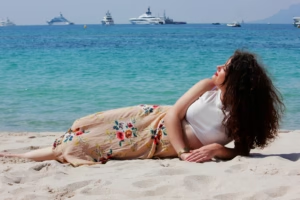
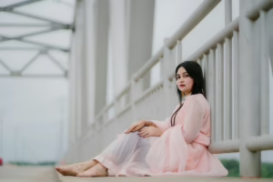
Pastel Tone Presets These gentle filters softly colour your photos with sweet pastel colours and hints. These are free adobe lightroom presets that adds soft, and fall color of tints in you images with cotton candy skies is perfect for all types of Photography. Ideal for bloggers, photographers or creatives looking to achieve pastel tones with natural lighten skin tones in their images and photos.

Post Title :
free adobe lightroom presets
Presets Name :
Pastel Tone Presets
Brand :
File Type :
DNG , .XMP
Compatibility :
Mobile, Windows, Mac
Price :
Free To Download
How to Use
Pastel Tone Presets
on Mobile ( iOS & Android ):
- Adobe Lightroom Mobile is downloadable from the App Store or Google Play.
- Download and unzip the preset files and you will get DNG on your iOS & Android.
- Open up Lightroom Mobile and either create/sign on an Adobe account.
- Import the DNG preset file: Launch Lightroom > tap three-dot menu > Import Presets > select the preset files on your device.
- Open a photo in Lightroom mobile, then swipe up on the checklist of presets at the bottom to view all associated with your account.
- You can now tap on the imported preset and a TOOLS-based organizer will pop up where you need to paste (“APPLY”) this specific preset on your photo.
- Make any adjustments if necessary and save/export your edited photo.
- How to Use Presets on Windows
- Unzip the downloaded files that will be in XMP format.
- Open the Lightroom desktop application.
- There, click on File > Import Profiles and Presets.
- Choose the folder containing your unzipped preset files.
- Tap Import to import the presets into Lightroom.
- 3> Open a photo, go into the Develop module, you wil see the Presets panel on left side and Look for the preset.
- Swipe the sliders to adjust pieces of the photo, then save off a copy of what you changed.
- How to use Presets on macOS:
- Download and unzip the preset files on your Mac.
- Open and select Lightroom desktop on your Mac.
- File — Import Profiles and Presets…from the top menu.
- Find the preset files on your Mac and open them.
- Press on Import to use presets in Lightroom.
- Open a photo in the Develop module and navigate to the Presets panel, choose a preset.
- Edit the photo to your liking when finished save it or export the edited version.
- Additional tips:
- If you sync your presets with Lightroom CC desktop, they will automatically appear on lightroom mobile when you’re logged in with the same Adobe account.
- This is a workflow option for consistent editing using Lightroom presets, no matter the device. The import differs slightly by platform but the process is simple on all devices. After you have the presets set, the rest is as simple as a click or tap for some big time savings when you’re editing.
free adobe lightroom presets
Setting | Value | Descriptions
Basic Panel (Tone & Presence)
| Section | Setting | Value | Description |
| Basic | Temp (White Balance) | 0 | No change to the red-to-blue warmth balance. |
| Tint (White Balance) | +7 | Shifted the color balance slightly towards magenta (away from green). | |
| Exposure | +0.57 | Made the entire image noticeably brighter. | |
| Contrast | -42 | Significantly reduced the difference between light and dark areas, giving a flat/soft look. | |
| Highlights | -83 | Heavily dimmed the brightest areas (like clouds or lights) to recover major detail. | |
| Shadows | +50 | Strongly brightened the darkest areas to reveal hidden detail. | |
| Whites | -56 | Pulled back the absolute brightest white points, contributing to a flatter look. | |
| Blacks | +24 | Elevated the black point, making the darkest shadows appear faded or matte. | |
| Texture | -4 | Negligibly softened fine surface details. | |
| Clarity | +32 | Sharpened the mid-tones, making the image look more defined. | |
| Dehaze | +6 | Very slightly reduced atmospheric haze/fog. | |
| Vibrance | +28 | Boosted the intensity of the less-saturated colors for a lively look. | |
| Saturation | -12 | Slightly reduced the overall color intensity across the board. |
HSL / Color Mixer Panel
| Section | Setting | Value | Description |
| HSL Mixer (Red) | Hue | -4 | Very slightly shifted red colors towards magenta. |
| HSL Mixer (Orange) | -10 | Shifted orange colors slightly towards red. | |
| HSL Mixer (Yellow) | -78 | Extremely shifted yellow colors towards red/orange. | |
| HSL Mixer (Green) | -56 | Strongly shifted green colors towards yellow. | |
| HSL Mixer (Aqua) | +42 | Strongly shifted aqua/cyan colors towards blue. | |
| HSL Mixer (Blue) | -42 | Strongly shifted blue colors towards aqua/cyan. | |
HSL Mixer (Purple/Magenta) | 0 | No change to the hue of purple or magenta. | |
| HSL Mixer (Red) | Saturation | +10 | Slightly boosted red vibrancy. |
| HSL Mixer (Orange) | +14 | Slightly boosted orange vibrancy. | |
| HSL Mixer (Yellow) | +10 | Slightly boosted yellow vibrancy. | |
| HSL Mixer (Green) | -64 | Heavily desaturated the green colors | |
| HSL Mixer (Aqua) | +10 | Slightly boosted aqua / cyan vibrancy. | |
| HSL Mixer (Blue) | +24 | Boosted blue vibrancy. | |
HSL Mixer (Purple/Magenta) | 0 | No change to purple or magenta vibrancy. | |
| HSL Mixer (Red/Orange/Aqua/Purple/Magenta) | Luminance | 0 | No change to the brightness of these tones. |
| HSL Mixer (Yellow) | -12 | Slightly darkened the yellow tones. | |
| HSL Mixer (Green) | +22 | Brightened the green tones. | |
| HSL Mixer (Blue) | +20 | Brightened the blue tones. |
Colour Grading Panel
| Section | Setting | Value | Description |
| Color Grading (Shadows) | Hue/Sat | 42 / 9 | Tinted the shadows a light orange/yellow-orange color. |
| Color Grading (Shadows) | Luminance | 0 | No change to the brightness of the shadows. |
| Color Grading (Shadows) | Blending/Balance | 100 / -38 | Maximum blending of the shadow tint, with the tint being more aggressive in the darker mid-tones. |
| Color Grading (Highlights) | Hue/Sat | 54 / 7 | Tinted the highlights a light yellow color. |
| Color Grading (Highlights) | Luminance | 0 | No change to the brightness of the highlights. |
| Color Grading (Highlights) | Blending/Balance | 100 / -38 | Maximum blending of the highlight tint, with the tint being more aggressive in the brighter mid-tones. |
Detail Panel
| Section | Setting | Value | Description |
| Detail (Sharpening) | Amount | 16 | A very light amount of sharpening applied. |
| Detail (Sharpening) | Radius/Detail/Masking | 1.0 / 25 / 0 | Sharpening is applied to medium edges everywhere with average radius. |
| Detail (Luminance NR) | Luminance | 27 | A moderate amount of grain/monochrome noise reduction applied. |
| Detail (Luminance NR) | Detail/Contrast | 50 / 0 | Medium detail retained, no contrast sacrifice in luminance noise reduction. |
| Detail (Color NR) | Color | 15 | A light amount of color noise reduction applied. |
| Detail (Color NR) | Detail/Smoothness | 50 / 50 | Medium settings for detail retention and smoothing in color noise reduction. |