All Categories
- Aesthetic Presets
- Cinematic Presets
- Portraits Presets
- Bright & Airy Presets
- Wedding Presets
- Travel Presets
- Film Presets
- Vintage Presets
- Beginners Presets
- Black & White Presets
- Food Presets
- Instagram Presets
- Mobile Presets
- Moody Presets
- Nature Presets
- Product Presets
- Professional Presets
- Real Estate Presets
- Sport Presets
- Summer Presets
- Wildlife Presets
- Winter Presets


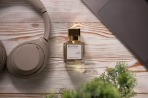
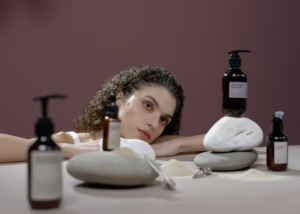
lightroom preset for products
High-Key Product Presets
High-Key Product Presets is a professional lightroom preset for products; designed to make bright and clean / polished product images; highlight your details in the best possible way. With these presets you will lower the shadows, whiten and get that clean minimalist look. Ideal for e-commerce, catalogues and branding, they capture products in a beautiful, clear and consistent style.
Post Title :
lightroom preset for products
Presets Name :
High-Key Product Presets
Brand :
File Type :
DNG , .XMP
Compatibility :
Mobile, Windows, Mac
Price :
Free To Download
How to Use
High-Key Product Presets
on Mobile ( iOS & Android ):
- Adobe Lightroom Mobile is downloadable from the App Store or Google Play.
- Download and unzip the preset files and you will get DNG on your iOS & Android.
- Open up Lightroom Mobile and either create/sign on an Adobe account.
- Import the DNG preset file: Launch Lightroom > tap three-dot menu > Import Presets > select the preset files on your device.
- Open a photo in Lightroom mobile, then swipe up on the checklist of presets at the bottom to view all associated with your account.
- You can now tap on the imported preset and a TOOLS-based organizer will pop up where you need to paste (“APPLY”) this specific preset on your photo.
- Make any adjustments if necessary and save/export your edited photo.
- How to Use Presets on Windows
- Unzip the downloaded files that will be in XMP format.
- Open the Lightroom desktop application.
- There, click on File > Import Profiles and Presets.
- Choose the folder containing your unzipped preset files.
- Tap Import to import the presets into Lightroom.
- 3> Open a photo, go into the Develop module, you wil see the Presets panel on left side and Look for the preset.
- Swipe the sliders to adjust pieces of the photo, then save off a copy of what you changed.
- How to use Presets on macOS:
- Download and unzip the preset files on your Mac.
- Open and select Lightroom desktop on your Mac.
- File — Import Profiles and Presets…from the top menu.
- Find the preset files on your Mac and open them.
- Press on Import to use presets in Lightroom.
- Open a photo in the Develop module and navigate to the Presets panel, choose a preset.
- Edit the photo to your liking when finished save it or export the edited version.
- Additional tips:
- If you sync your presets with Lightroom CC desktop, they will automatically appear on lightroom mobile when you’re logged in with the same Adobe account.
- This is a workflow option for consistent editing using Lightroom presets, no matter the device. The import differs slightly by platform but the process is simple on all devices. After you have the presets set, the rest is as simple as a click or tap for some big time savings when you’re editing.
lightroom preset for products
Setting | Value | Descriptions
Basic Panel (Tone & Presence)
| Section | Setting | Value | Description |
| Basic (WB) | Temp | 0 | The color temperature is neutral (no warm/cool shift). |
| Tint | +1 | A very slight shift toward Magenta is applied. | |
| Exposure | +0.65 | The overall image is made moderately brighter. | |
| Contrast | +15 | A small boost in contrast is applied, increasing the difference between light and dark areas. | |
| Highlights | -71 | Brightest areas are strongly recovered/darkened to restore detail. | |
| Shadows | +39 | Dark areas are moderately brightened to pull detail out of the shadows. | |
| Whites | +11 | The bright white points are slightly boosted. | |
| Blacks | -16 | The deep black points are slightly darkened/crushed to add depth. | |
| Texture | +20 | A moderate increase in fine surface detail and texture is applied. | |
| Clarity | +13 | Mid – tone contrast is slightly increased , making the image appear crisper. | |
| Dehaze | 0 | No dehaze or haze is applied. | |
| Vibrance | +16 | Subtle colors are moderately boosted, enhancing overall color without oversaturating skin tones. | |
| Saturation | +4 | A very small, overall increase in color intensity is applied. |
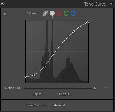
Tone Curve Panel
HSL / Color Mixer Panel
| Section | Setting | Value | Description |
| Color Mixer (Hue) | Red | -53 | Reds are significantly shifted toward Magenta. |
| Orange | 0 | Orange hue is unchanged. | |
| Yellow | 0 | Yellow hue is unchanged. | |
| Green | 0 | Green hue is unchanged. | |
| Aqua | -54 | Aquas are strongly shifted toward Green. | |
| Blue | -49 | Blues are strongly shifted toward Aqua/Cyan. | |
| Purple | 0 | Purple hue is unchanged. | |
| Magenta | +52 | Magentas are strongly shifted toward Red/Purple. | |
| Color Mixer (Saturation) | Red | +19 | Red colors are slightly boosted (saturated). |
| Orange | -3 | Orange colors are very slightly muted. | |
| Yellow | -92 | Yellow colors are almost completely removed (highly desaturated). | |
| Green | 0 | Green saturation is unchanged. | |
| Aqua | -6 | Aqua colors are slightly muted. | |
| Blue | -62 | Blue colors are heavily muted (desaturated). | |
| Purple | 0 | Purple saturation is unchanged. | |
| Magenta | +55 | Magenta colors are strongly boosted (saturated). | |
| Color Mixer (Luminance) | Red | 0 | Red brightness is unchanged. |
| Orange | +7 | Orange colors are slightly brightened (often affects skin tones). | |
| Yellow | 0 | Yellow brightness is unchanged. | |
| Green | 0 | Green brightness is unchanged. | |
| Aqua | 0 | Aqua brightness is unchanged. | |
| Blue | 0 | Blue brightness is unchanged. | |
| Purple | 0 | Purple brightness is unchanged. | |
| Magenta | +57 | Magenta colors are strongly brightened. |
Colour Grading Panel
| Section | Setting | Value | Description |
| Color Grading (Shadows) | Hue/Sat | H: 214, S: 1 | A very slight blue tint is applied to the shadow areas. |
| Color Grading (Shadows) | Luminance | 0 | No Changes |
| Color Grading (Highlights) | Hue/Sat | H: 37, S: 22 | A moderate yellow – orange tint is applied to the highlight areas . |
| Color Grading (Highlights) | Luminance | 0 | No Changes |
| Color Grading (Global) | Blending | 100 | The transition/blend between the shadow and highlight colors is fully soft/merged. |
| Color Grading (Global) | Balance | 0 | The balance point between shadows and highlights is neutral. |
Detail Panel
| Section | Setting | Value | Description |
| Detail (Sharpening) | Amount | 8 | A very low level of overall sharpening is applied. |
| Detail (Sharpening) | Radius | 1.4 | Sharpening targets slightly broader details (higher radius). |
| Detail (Sharpening) | Detail | 25 | Lower detail setting means the edges are sharpened with less emphasis on fine texture. |
| Detail (Sharpening) | Masking | 0 | no edge masking . |
| Detail (Noise Reduction) | Luminance | 31 | A moderate amount of Luminance ( greyscale ) noise reduction is applied. |
| Detail (Noise Reduction) | Detail | 50 | (Default value) Standard preservation of detail during Luminance NR. |
| Detail (Noise Reduction) | Contrast | 0 | (Default value) No Contrast adjustment during Luminance NR. |
| Detail (Noise Reduction) | Color | 25 | A small amount of Color noise reduction (chroma noise) is applied. |
| Detail (Noise Reduction) | Detail | 50 | (Default value) Standard preservation of color detail during Color NR. |
| Detail (Noise Reduction) | Smoothness | 50 | (Default value) Standard smoothness applied during Color NR. |
Calibration Panel
| Section | Setting | Value | Description |
| Calibration | Process | Version 6 (Current) | Uses the latest raw processing engine. |
| Calibration (Shadows) | Tint | 0 | No color shift applied to the shadow areas. |
| Calibration (Red Primary) | Hue | +30 | The fundamental Red color channel is strongly shifted toward Orange/Yellow. |
| Calibration (Red Primary) | Saturation | -10 | The fundamental Red color channel is slightly desaturated. |
| Calibration (Green Primary) | Hue | +50 | The fundamental Green color channel is maximally shifted toward Yellow. |
| Calibration (Green Primary) | Saturation | -10 | The fundamental Green color channel is slightly desaturated. |
| Calibration (Blue Primary) | Hue | -12 | The fundamental Blue color channel is slightly shifted toward Cyan/Aqua. |
| Calibration (Blue Primary) | Saturation | -15 | The fundamental Blue color channel is moderately desaturated. |