All Categories
- Aesthetic Presets
- Cinematic Presets
- Portraits Presets
- Bright & Airy Presets
- Wedding Presets
- Travel Presets
- Film Presets
- Vintage Presets
- Beginners Presets
- Black & White Presets
- Food Presets
- Instagram Presets
- Mobile Presets
- Moody Presets
- Nature Presets
- Product Presets
- Professional Presets
- Real Estate Presets
- Sport Presets
- Summer Presets
- Wildlife Presets
- Winter Presets


best lightroom presets for travel
Cityscape Presets
Cityscape Presets: The best Lightroom presets for travel, ideal for urban photography. Intended to enhance the sharpness, contrast and vibrant tones of architecture, colorful lights and dynamic ambience in cities across the world. Perfect for bloggers and travel, the things turn average snaps into stunning images with a slick modern look.


Post Title :
best lightroom presets for travel
Presets Name :
Cityscape Presets
Brand :
File Type :
DNG , .XMP
Compatibility :
Mobile, Windows, Mac
Price :
Free To Download
How to Use
Cityscape Presets
on Mobile ( iOS & Android ):
- Adobe Lightroom Mobile is downloadable from the App Store or Google Play.
- Download and unzip the preset files and you will get DNG on your iOS & Android.
- Open up Lightroom Mobile and either create/sign on an Adobe account.
- Import the DNG preset file: Launch Lightroom > tap three-dot menu > Import Presets > select the preset files on your device.
- Open a photo in Lightroom mobile, then swipe up on the checklist of presets at the bottom to view all associated with your account.
- You can now tap on the imported preset and a TOOLS-based organizer will pop up where you need to paste (“APPLY”) this specific preset on your photo.
- Make any adjustments if necessary and save/export your edited photo.
- How to Use Presets on Windows
- Unzip the downloaded files that will be in XMP format.
- Open the Lightroom desktop application.
- There, click on File > Import Profiles and Presets.
- Choose the folder containing your unzipped preset files.
- Tap Import to import the presets into Lightroom.
- 3> Open a photo, go into the Develop module, you wil see the Presets panel on left side and Look for the preset.
- Swipe the sliders to adjust pieces of the photo, then save off a copy of what you changed.
- How to use Presets on macOS:
- Download and unzip the preset files on your Mac.
- Open and select Lightroom desktop on your Mac.
- File — Import Profiles and Presets…from the top menu.
- Find the preset files on your Mac and open them.
- Press on Import to use presets in Lightroom.
- Open a photo in the Develop module and navigate to the Presets panel, choose a preset.
- Edit the photo to your liking when finished save it or export the edited version.
- Additional tips:
- If you sync your presets with Lightroom CC desktop, they will automatically appear on lightroom mobile when you’re logged in with the same Adobe account.
- This is a workflow option for consistent editing using Lightroom presets, no matter the device. The import differs slightly by platform but the process is simple on all devices. After you have the presets set, the rest is as simple as a click or tap for some big time savings when you’re editing.
best lightroom presets for travel
Setting | Value | Descriptions
Basic Panel (Tone & Presence)
| Section | Setting | Value | Description |
| Basic | Profile | Modern 04 | Camera profile used to change the way colors look. |
| Amount | 198 | How strong the profile effect is. | |
| Temp | 22 | The image’s color temperature (warmth). | |
| Tint | 8 | Balance of green and magenta tints. | |
| Exposure | -1.02 | Changes the brightness of the whole picture. | |
| Contrast | 24 | Controls the difference between light and dark areas. | |
| Highlights | -7 | Recovers information in bright places. | |
| Shadows | 57 | Gets back details in dark places. | |
| Whites | -37 | The white point of the picture is set. | |
| Blacks | 40 | This sets the image’s black point. | |
| Texture | 4 | Makes medium details sharper or softer. | |
| Clarity | 0 | Adds sharpness and contrast to the midtones. | |
| Dehaze | 31 | It makes things less hazy and more distinct. | |
| Vibrance | 15 | Brings out muted colors without making them too bright. | |
| Saturation | 0 | Changes the overall color intensity up or down. |
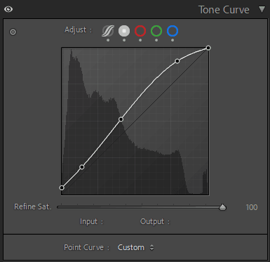
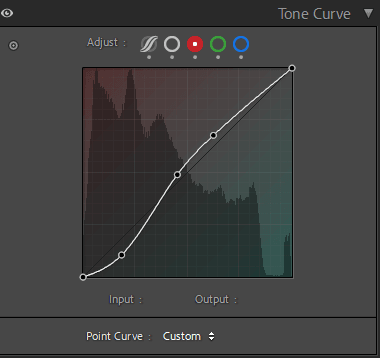
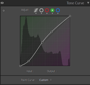
Tone Curve Panel
| Section | Setting | Value | Description |
| Tone Curve | Highlights | -26 | Changes the brightness of the highlights. |
| Lights | -6 | Changes how bright light tones are. | |
| Darks | 26 | Changes how bright dark tones are. | |
| Shadows | 20 | Changes how bright the shadows are. |

HSL / Color Mixer Panel
| Section | Setting | Value | Description |
| Color Mixer – Hue | Red | 18 | Changes the color of reds. |
| Orange | 6 | Changes the color of oranges. | |
| Yellow | 5 | Changes the color of yellows. | |
| Green | -42 | Changes the color of greens. | |
| Aqua | 30 | Changes the color of aquas. | |
| Blue | -13 | Changes the color of blues. | |
| Purple | 0 | Changes the color of purples. | |
| Magenta | 0 | Changes the color of magentas. | |
| Color Mixer – Saturation | Red | -18 | Changes how strong the red tones are. |
| Orange | -34 | Changes how strong the orange tones are. | |
| Yellow | -58 | Changes how bright the yellow tones are. | |
| Green | -95 | Alters the strength of green tones. | |
| Aqua | -50 | Changes how strong the aqua tones are. | |
| Blue | -87 | Changes how strong the blue tones are. | |
| Purple | 0 | Alters how strong the purple tones are. | |
| Magenta | 0 | Changes how strong the magenta tones are. | |
| Color Mixer – Luminance | Red | 12 | Changes how bright the red tones are. |
| Orange | 4 | Changes how bright orange tones are. | |
| Yellow | 28 | Changes how bright yellow tones are. | |
| Green | 9 | Changes how bright green tones are. | |
| Aqua | 17 | Changes how bright aqua tones are. | |
| Blue | 8 | Changes how bright blue tones are. | |
| Purple | 0 | Changes how bright purple tones are. | |
| Magenta | 0 | Changes how bright the magenta tones are. |
Colour Grading Panel
| Section | Setting | Value | Description |
| Color Grading – Shadows | Hue | 192 | Hue put on shadow tones. |
| Color Grading – Shadows | Saturation | 10 | Saturation of the color of the shadow. |
| Color Grading – Highlights | Hue | 196 | Hue used to make tones stand out. |
| Color Grading – Highlights | Saturation | 10 | Saturation of the color of the highlight. |
| Color Grading | Blending | 100 | Blend shadows, midtones, and highlights. |
| Color Grading | Balance | 0 | Find a good balance between shadows and highlights. |
Effects Panel
| Section | Setting | Value | Description |
| Effects | Post-Crop Vignetting Amount | -12 | Makes the edges of the picture darker or brighter. |
| Midpoint | 50 | Sets the strength of the vignette effect. | |
| Roundness | 0 | Changes the shape of the vignette. | |
| Feather | 50 | Makes the edges of the vignette less sharp. | |
| Highlights | 0 | Brings back highlights in areas that are vignetted. | |
| Grain Amount | 0 | Adds grain like in movies. | |
| Grain Size | 25 | The size of the grains. | |
| Grain Roughness | 50 | Makes the grain pattern look uneven. |
Calibration Panel
| Section | Setting | Value | Description |
| Calibration | Red Primary Hue | 27 | Changes the color of reds in calibration. |
| Red Primary Saturation | -18 | Changes the saturation of reds during calibration. | |
| Green Primary Hue | 47 | Changes the color of greens in calibration. | |
| Green Primary Saturation | -10 | Changes how saturated the greens are in calibration. | |
| Blue Primary Hue | -56 | Changes the color of blues in calibration. | |
| Blue Primary Saturation | -27 | Changes the saturation of blues during calibration. |