All Categories
- Aesthetic Presets
- Cinematic Presets
- Portraits Presets
- Bright & Airy Presets
- Wedding Presets
- Travel Presets
- Film Presets
- Vintage Presets
- Beginners Presets
- Black & White Presets
- Food Presets
- Instagram Presets
- Mobile Presets
- Moody Presets
- Nature Presets
- Product Presets
- Professional Presets
- Real Estate Presets
- Sport Presets
- Summer Presets
- Wildlife Presets
- Winter Presets


black and white lightroom presets
Moody Black and White Presets
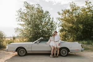
Add a timeless, moody feel to your images with these Black and White Lightroom Presets, by lifting the contrast and deepening shadows. These black and white moody presets will work with any style, be it portraits, landscape or urban photography bringing drama to tones, cinematic depth and emotional storytelling. Turn plain looking shots into beautifully mesmerizing pieces of art in one click.

Post Title :
black and white lightroom presets
Presets Name :
Moody Black and White Presets
Brand :
File Type :
DNG , .XMP
Compatibility :
Mobile, Windows, Mac
Price :
Free To Download
How to Use
Moody Black and White Presets
on Mobile ( iOS & Android ):
- Adobe Lightroom Mobile is downloadable from the App Store or Google Play.
- Download and unzip the preset files and you will get DNG on your iOS & Android.
- Open up Lightroom Mobile and either create/sign on an Adobe account.
- Import the DNG preset file: Launch Lightroom > tap three-dot menu > Import Presets > select the preset files on your device.
- Open a photo in Lightroom mobile, then swipe up on the checklist of presets at the bottom to view all associated with your account.
- You can now tap on the imported preset and a TOOLS-based organizer will pop up where you need to paste (“APPLY”) this specific preset on your photo.
- Make any adjustments if necessary and save/export your edited photo.
- How to Use Presets on Windows
- Unzip the downloaded files that will be in XMP format.
- Open the Lightroom desktop application.
- There, click on File > Import Profiles and Presets.
- Choose the folder containing your unzipped preset files.
- Tap Import to import the presets into Lightroom.
- 3> Open a photo, go into the Develop module, you wil see the Presets panel on left side and Look for the preset.
- Swipe the sliders to adjust pieces of the photo, then save off a copy of what you changed.
- How to use Presets on macOS:
- Download and unzip the preset files on your Mac.
- Open and select Lightroom desktop on your Mac.
- File — Import Profiles and Presets…from the top menu.
- Find the preset files on your Mac and open them.
- Press on Import to use presets in Lightroom.
- Open a photo in the Develop module and navigate to the Presets panel, choose a preset.
- Edit the photo to your liking when finished save it or export the edited version.
- Additional tips:
- If you sync your presets with Lightroom CC desktop, they will automatically appear on lightroom mobile when you’re logged in with the same Adobe account.
- This is a workflow option for consistent editing using Lightroom presets, no matter the device. The import differs slightly by platform but the process is simple on all devices. After you have the presets set, the rest is as simple as a click or tap for some big time savings when you’re editing.
black and white lightroom presets
Setting | Value | Descriptions
Basic Panel (Tone & Presence)
| Section | Setting | Value | Description |
| Basic | Profile | Modern 03 | The picture was given a creative look. |
| Amount | 100 | How strong the chosen profile is. | |
| Temp | 17 | Adjust the white balance temperature (warm or cool). | |
| Tint | -10 | Change the white balance tint (green or magenta). | |
| Exposure | -0.07 | Changes how bright the whole picture is. | |
| Contrast | 38 | Makes the difference between light and dark areas bigger. | |
| Highlights | -5 | Brings back detail in bright places. | |
| Shadows | 29 | Brings back detail in dark places. | |
| Whites | -42 | Changes the white point, which changes the brightest colors. | |
| Blacks | -31 | Changes the black point, which changes the darkest tones. | |
| Texture | 0 | Makes medium-sized details stand out more or less. | |
| Clarity | 5 | Makes the contrast in the middle tones stronger. | |
| Dehaze | 2 | Adds or takes away haze from the air. | |
| Vibrance | -29 | Changes the saturation of colors that aren’t very saturated. | |
| Saturation | 0 | Changes the overall strength of the color. |
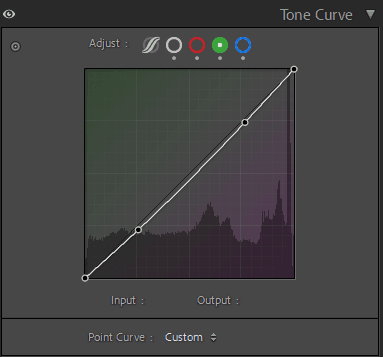
Tone Curve Panel


HSL / Color Mixer Panel
| Section | Setting | Value | Description |
| Color Mixer – Hue | Red | 0 | Changes the color of red tones. |
| Orange | -5 | Changes the color of orange tones. | |
| Yellow | -70 | Changes the color of yellow tones. | |
| Green | 100 | Changes the color of green tones. | |
| Aqua | 100 | Changes the color of aqua tones. | |
| Blue | -31 | Changes the color of blue tones. | |
| Purple | -100 | Changes the color of purple tones. | |
| Magenta | -100 | Changes the color of magenta tones. | |
| Color Mixer – Saturation | Red | -30 | Changes how bright the red tones are. |
| Orange | -33 | Changes how bright the orange tones are. | |
| Yellow | -85 | Changes how bright the yellow tones are. | |
| Green | -100 | Changes how bright the green tones are. | |
| Aqua | -25 | Changes how bright the aqua tones are. | |
| Blue | -86 | Changes how bright the blue tones are. | |
| Purple | -100 | Changes how bright the purple tones are. | |
| Magenta | -100 | Changes how bright the magenta tones are. | |
| Color Mixer – Luminance | Red | 15 | Changes how bright the red tones are. |
| Orange | 31 | Changes how bright the orange tones are. | |
| Yellow | 12 | Changes how bright the yellow tones are. | |
| Green | -36 | Changes how bright the green tones are. | |
| Aqua | -73 | Changes how bright aqua tones are. | |
| Blue | -71 | Changes how bright the blue tones are. | |
| Purple | -34 | Changes how bright the purple tones are. | |
| Magenta | -24 | Changes the brightness of magenta colors. |
Colour Grading Panel
| Section | Setting | Value | Description |
| Color Grading | Shadows Hue | 225 | Hue value used for shadows. |
| Shadows Saturation | 24 | Color saturation in shadows. | |
| Shadows Luminance | 0 | Color grading for the brightness of shadows. | |
| Highlights Hue | 72 | The hue value is used on the highlights. | |
| Highlights Saturation | 18 | Saturation of color in highlights. | |
| Highlights Luminance | 0 | The brightness of highlights in color grading. | |
| Blending | 100 | How colors from shadows, midtones, and highlights mix. | |
| Balance | -19 | Grading the balance between shadows and highlights. |
Detail Panel
| Section | Setting | Value | Description |
| Detail | Sharpening Amount | 10 | Sets the strength of sharpening. |
| Radius | 1 | Sets the size of the edges that need to be improved. | |
| Detail | 25 | Sets the amount of detail that is sharpened. | |
| Masking | 15 | Sharpens only edges and stays away from flat areas. |
Effects Panel
| Section | Setting | Value | Description |
| Noise Reduction | Luminance | 15 | Lessens noise in the light. |
| Detail | 50 | Keeps details when lowering luminance noise. | |
| Contrast | 3 | When you lower the brightness noise, it controls the contrast. | |
| Color | 15 | Lessens color noise. | |
| Color Detail | 50 | Keeps details while lowering color noise. | |
| Smoothness | 54 | Controls how smooth the color noise reduction is. |