All Categories
- Aesthetic Presets
- Cinematic Presets
- Portraits Presets
- Bright & Airy Presets
- Wedding Presets
- Travel Presets
- Film Presets
- Vintage Presets
- Beginners Presets
- Black & White Presets
- Food Presets
- Instagram Presets
- Mobile Presets
- Moody Presets
- Nature Presets
- Product Presets
- Professional Presets
- Real Estate Presets
- Sport Presets
- Summer Presets
- Wildlife Presets
- Winter Presets


make photos look vintage
Warm Vintage Presets
Make photos look vintage this Woody Lightroom presets can be easily adjusted to fit your image, simply by clicking a few buttons in Lightroom and it will adjust these presets according to your photo. Ideal for portraits, scenics and lifestyle images, these bring classic character with a retro vibe. Bring atmosphere, tone and a classic golden era of photography to your images.


Post Title :
make photos look vintage
Presets Name :
Warm Vintage Presets
Brand :
File Type :
DNG , .XMP
Compatibility :
Mobile, Windows, Mac
Price :
Free To Download
How to Use
Warm Vintage Presets
on Mobile ( iOS & Android ):
- Adobe Lightroom Mobile is downloadable from the App Store or Google Play.
- Download and unzip the preset files and you will get DNG on your iOS & Android.
- Open up Lightroom Mobile and either create/sign on an Adobe account.
- Import the DNG preset file: Launch Lightroom > tap three-dot menu > Import Presets > select the preset files on your device.
- Open a photo in Lightroom mobile, then swipe up on the checklist of presets at the bottom to view all associated with your account.
- You can now tap on the imported preset and a TOOLS-based organizer will pop up where you need to paste (“APPLY”) this specific preset on your photo.
- Make any adjustments if necessary and save/export your edited photo.
- How to Use Presets on Windows
- Unzip the downloaded files that will be in XMP format.
- Open the Lightroom desktop application.
- There, click on File > Import Profiles and Presets.
- Choose the folder containing your unzipped preset files.
- Tap Import to import the presets into Lightroom.
- 3> Open a photo, go into the Develop module, you wil see the Presets panel on left side and Look for the preset.
- Swipe the sliders to adjust pieces of the photo, then save off a copy of what you changed.
- How to use Presets on macOS:
- Download and unzip the preset files on your Mac.
- Open and select Lightroom desktop on your Mac.
- File — Import Profiles and Presets…from the top menu.
- Find the preset files on your Mac and open them.
- Press on Import to use presets in Lightroom.
- Open a photo in the Develop module and navigate to the Presets panel, choose a preset.
- Edit the photo to your liking when finished save it or export the edited version.
- Additional tips:
- If you sync your presets with Lightroom CC desktop, they will automatically appear on lightroom mobile when you’re logged in with the same Adobe account.
- This is a workflow option for consistent editing using Lightroom presets, no matter the device. The import differs slightly by platform but the process is simple on all devices. After you have the presets set, the rest is as simple as a click or tap for some big time savings when you’re editing.
make photos look vintage
Setting | Value | Descriptions
Basic Panel (Tone & Presence)
| Section | Setting | Value | Description |
| Basic | Profile | Color | Standard color profile applied |
| Temp | 33 | Warms image tone significantly | |
| Tint | 14 | Adds magenta tint to balance colors | |
| Exposure | 0 | No exposure change | |
| Contrast | -29 | Reduces contrast for a softer look | |
| Highlights | -27 | Recovers bright detail | |
| Shadows | 15 | Lifts shadows for better visibility | |
| Whites | 44 | Increases white point brightness | |
| Blacks | 4 | Slightly lifts darkest tones | |
| Texture | 0 | No change in texture | |
| Clarity | 20 | Enhances midtone contrast moderately | |
| Dehaze | 3 | Removes slight atmospheric haze | |
| Vibrance | -41 | Reduces intensity of muted colors | |
| Saturation | -21 | Lowers all colors’ overall saturation |
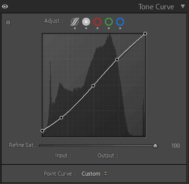
Tone Curve Panel
| Section | Setting | Value | Description |
| Tone Curve | Highlights | -27 | Reduces brightness in highlight areas |
| Lights | 13 | Lightens midtones | |
| Darks | -44 | Deepens dark tones for contrast | |
| Shadows | 93 | Lifts shadows strongly, faded black effect |
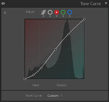
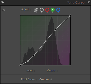
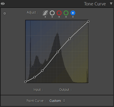
HSL / Color Mixer Panel
| Section | Setting | Value | Description |
| Color Mixer (HSL) | Hue – Red | 35 | Shifts reds toward orange |
| Hue – Orange | 20 | Warmer orange tones | |
| Hue – Yellow | 24 | Moves yellow slightly toward orange | |
| Hue – Green | 31 | Pushes greens toward aqua | |
| Hue – Aqua | 0 | No change | |
| Hue – Blue | -13 | Moves blue tones toward teal | |
| Hue – Purple | 30 | Shifts purples toward magenta | |
| Hue – Magenta | 15 | Moves magentas toward red | |
| Saturation – Red | 49 | Boosts red color intensity | |
| Saturation – Orange | 50 | Enhances orange vibrancy | |
| Saturation – Yellow | 2 | Slightly increases yellow saturation | |
| Saturation – Green | 15 | Enhances green intensity | |
| Saturation – Aqua | -12 | Mutes aqua tones | |
| Saturation – Blue | -80 | Greatly desaturates blues | |
| Saturation – Purple | -10 | Slightly reduces purple saturation | |
| Saturation – Magenta | 7 | Subtly increases magenta saturation | |
| Luminance – Red | -4 | Darkens reds slightly | |
| Luminance – Orange | 28 | Brightens oranges | |
| Luminance – Yellow | -17 | Darkens yellows | |
| Luminance – Green | 17 | Brightens greens | |
| Luminance – Aqua | 17 | Brightens aqua tones | |
| Luminance – Blue | -9 | Darkens blues slightly | |
| Luminance – Purple | -10 | Slightly darkens purple | |
| Luminance – Magenta | -25 | Darkens magenta tones |
Detail Panel
| Section | Setting | Value | Description |
| Detail | Sharpening Amount | 40 | Moderate sharpening applied |
| Radius | 1.2 | Slightly stronger edge sharpening | |
| Detail | 25 | Enhances fine details moderately | |
| Masking | 0 | Applies sharpening to entire image | |
| Luminance NR | 0 | No luminance noise reduction applied | |
| NR Detail | 50 | Default detail preservation | |
| NR Contrast | 0 | No contrast adjustment in noise reduction | |
| Color NR | 25 | Reduces color noise moderately | |
| NR Detail (Color) | 50 | Keeps fine color edges clear | |
| NR Smoothness | 50 | Smooths color transitions evenly |
Effects Panel
| Section | Setting | Value | Description |
| Effects | Vignetting Amount | -10 | Adds subtle dark corners |
| Midpoint | 29 | Centers vignette effect slightly inward | |
| Roundness | 5 | Slightly rounder vignette shape | |
| Feather | 64 | Softens vignette edge | |
| Highlights | 0 | No highlight preservation | |
| Grain Amount | 13 | Adds light film-like grain | |
| Grain Size | 25 | Medium grain particle size | |
| Grain Roughness | 60 | Slightly coarse texture to grain |
Calibration Panel
| Section | Setting | Value | Description |
| Calibration | Process | Version 6 (Current) | Latest color process engine used |
| Shadows Tint | 0 | Neutral shadow color | |
| Red Primary Hue | -5 | Shifts red tones slightly warmer | |
| Red Primary Saturation | 33 | Increases red color strength | |
| Green Primary Hue | 42 | Moves greens toward aqua | |
| Green Primary Saturation | -33 | Reduces green intensity | |
| Blue Primary Hue | -9 | Shifts blues toward teal | |
| Blue Primary Saturation | 0 | No change in blue saturation |