All Categories
- Aesthetic Presets
- Cinematic Presets
- Portraits Presets
- Bright & Airy Presets
- Wedding Presets
- Travel Presets
- Film Presets
- Vintage Presets
- Beginners Presets
- Black & White Presets
- Food Presets
- Instagram Presets
- Mobile Presets
- Moody Presets
- Nature Presets
- Product Presets
- Professional Presets
- Real Estate Presets
- Sport Presets
- Summer Presets
- Wildlife Presets
- Winter Presets


moody green lightroom preset
Cinematic Moody Presets
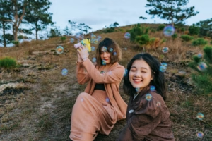
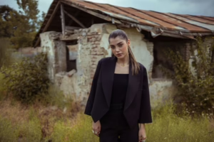
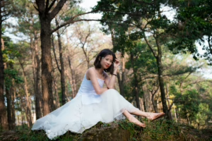
Moody Cinematic Presets will add depth and drama to your photos, add rich atmosphere with moody green Lightroom preset. This collection of presets will darken shadows, balance highlights and adds a sharp film look to your portrait photography, landscapes,or creative editing. Ideal for couple and intuitive, emotive and cinematic storytellers looking back in timeless visuals with a bold impact.
Post Title :
moody green lightroom preset
Presets Name :
Cinematic Moody Presets
Brand :
File Type :
DNG , .XMP
Compatibility :
Mobile, Windows, Mac
Price :
Free To download
How to Use
Cinematic Moody Presets
on Mobile ( iOS & Android ):
- Adobe Lightroom Mobile is downloadable from the App Store or Google Play.
- Download and unzip the preset files and you will get DNG on your iOS & Android.
- Open up Lightroom Mobile and either create/sign on an Adobe account.
- Import the DNG preset file: Launch Lightroom > tap three-dot menu > Import Presets > select the preset files on your device.
- Open a photo in Lightroom mobile, then swipe up on the checklist of presets at the bottom to view all associated with your account.
- You can now tap on the imported preset and a TOOLS-based organizer will pop up where you need to paste (“APPLY”) this specific preset on your photo.
- Make any adjustments if necessary and save/export your edited photo.
- How to Use Presets on Windows
- Unzip the downloaded files that will be in XMP format.
- Open the Lightroom desktop application.
- There, click on File > Import Profiles and Presets.
- Choose the folder containing your unzipped preset files.
- Tap Import to import the presets into Lightroom.
- 3> Open a photo, go into the Develop module, you wil see the Presets panel on left side and Look for the preset.
- Swipe the sliders to adjust pieces of the photo, then save off a copy of what you changed.
- How to use Presets on macOS:
- Download and unzip the preset files on your Mac.
- Open and select Lightroom desktop on your Mac.
- File — Import Profiles and Presets…from the top menu.
- Find the preset files on your Mac and open them.
- Press on Import to use presets in Lightroom.
- Open a photo in the Develop module and navigate to the Presets panel, choose a preset.
- Edit the photo to your liking when finished save it or export the edited version.
- Additional tips:
- If you sync your presets with Lightroom CC desktop, they will automatically appear on lightroom mobile when you’re logged in with the same Adobe account.
- This is a workflow option for consistent editing using Lightroom presets, no matter the device. The import differs slightly by platform but the process is simple on all devices. After you have the presets set, the rest is as simple as a click or tap for some big time savings when you’re editing.
moody green lightroom preset
Setting | Value | Descriptions
Basic Panel (Tone & Presence)
| Section | Setting | Value | Description |
| Basic | Temp | 24 | Warms up the photo by shifting white balance toward yellow. |
| Tint | 0 | Neutral tint (no shift toward green or magenta). | |
| Exposure | 0.57 | Slightly brightens the overall image. | |
| Contrast | 8 | Adds a little contrast between darks and lights. | |
| Highlights | -100 | Strongly recovers details in bright areas (highlights). | |
| Shadows | 60 | Brightens shadow details. | |
| Whites | -51 | Reduces the intensity of white tones. | |
| Blacks | -27 | Deepens blacks for richer shadows. | |
| Texture | 3 | Slightly enhances fine details. | |
| Clarity | 18 | Adds midtone contrast and punch. | |
| Dehaze | 0 | No dehaze applied. | |
| Vibrance | -43 | Significantly reduces the intensity of less saturated colors. | |
| Saturation | -3 | Slightly desaturates all colors. |
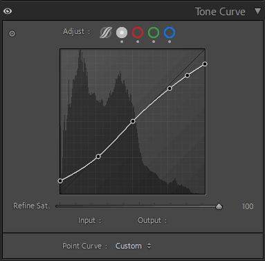
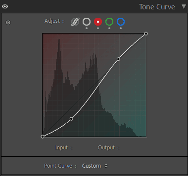
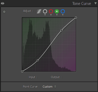
Tone Curve Panel

HSL / Color Mixer Panel
| Section | Setting | Value | Description |
| HSL/Color | Hue – Yellow | -35 | Shifts yellows toward orange. |
| Hue – Green | -77 | Shifts greens toward yellow. | |
| Saturation – Orange | 7 | Slightly boosts orange saturation. | |
| Saturation – Yellow | -30 | Reduces yellow saturation. | |
| Saturation – Green | -45 | Desaturates green tones. | |
| Saturation – Blue | -52 | Strongly desaturates blue tones. | |
| Luminance – Red | 23 | Brightens reds. | |
| Luminance – Orange | 21 | Brightens oranges. | |
| Luminance – Yellow | 37 | Brightens yellows. | |
| Luminance – Green | 45 | Brightens greens. | |
| Luminance – Blue | 6 | Slightly brightens blues. |
Colour Grading Panel
| Section | Setting | Value | Description |
| Color Grading | Shadows Hue | 235 | Adds a blue hue to the shadows. |
| Shadows Sat | 5 | Subtle blue tint in shadows. | |
| Shadows Luminance | 3 | Slightly brightens shadows. | |
| Midtones Hue | 0 | No color tint added to midtones. | |
| Midtones Sat | 0 | No saturation change to midtones. | |
| Midtones Luminance | 5 | Brightens midtones. | |
| Highlights Hue | 67 | Adds a yellow-green hue to highlights. | |
| Highlights Sat | 8 | Subtle yellow-green tint in highlights. | |
| Highlights Luminance | -8 | Slightly darkens highlights. | |
| Blending | 100 | Maximum blend between shadow, midtone, and highlight color grading. | |
| Balance | -38 | Favors the shadow color grading more than highlights. |
Effects Panel
| Section | Setting | Value | Description |
| Effects | Post-Crop Vignette Amount | -23 | Adds a subtle dark vignette to the edges. |
| Midpoint | 19 | Narrows the vignette closer to the center. | |
| Roundness | 0 | Default shape of vignette. | |
| Feather | 77 | Makes vignette edges very soft. | |
| Highlights | 0 | No vignette preservation for highlights. | |
| Grain Amount | 0 | No film grain added. |
Calibration Panel
| Section | Setting | Value | Description |
| Calibration | Red Primary Hue | 13 | Shifts red channel hue for color calibration. |
| Red Primary Sat | 0 | No change in red channel saturation. | |
| Green Primary Hue | 14 | Shifts green channel hue for color calibration. | |
| Green Primary Sat | 25 | Boosts green channel saturation. | |
| Blue Primary Hue | 0 | No change in blue channel hue. | |
| Blue Primary Sat | 0 | No change in blue channel saturation. |